
Case Study: The Kinetic Elegance of Zenbu Sushi
Overview
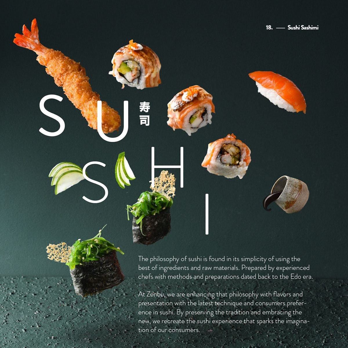
The final concept in this series, designed for Zenbu, moves away from static grid-based layouts and embraces dynamic movement. This design treats the digital screen like a gallery wall, using “exploding” or floating elements to create a sense of weightlessness and avant-garde luxury. It positions sushi not just as food, but as a high-art form.
Design Philosophy: The Floating Canvas
The standout feature of this layout is the deconstructed composition. By separating the ingredients and individual sushi pieces, the design creates a “frozen in time” effect.
-
Asymmetrical Typography: The word “SUSHI” is broken apart across the vertical space. This forces the user to engage with the text more slowly, mimicking the intentionality of a slow-paced, omakase-style meal.
-
Depth & Layering: Pieces like the tempura shrimp and uramaki rolls overlap the typography, creating a 3D effect. The subtle shadows beneath the floating food items provide just enough realism to make them feel tangible against the dark teal backdrop.
-
Texture Contrast: The bottom of the design features a rough, stippled texture (resembling volcanic stone or high-end ceramic), which provides a heavy “base” to balance the lightness of the floating elements above.
Visual Language & Copywriting
Zenbu’s design is heavily supported by storytelling that bridges the gap between historical tradition and modern innovation.
-
The Narrative: The copy explicitly mentions “methods and preparations dated back to the Edo era,” while simultaneously claiming to “enhance that philosophy… with the latest technique.” This dual-focus is reflected in the visuals—traditional nigiri floating alongside more modern, drizzled rolls.
-
Typography: The body text uses a refined, wide-set sans-serif. The generous character spacing (kerning) suggests an upscale, high-fashion editorial influence.
-
Color Palette: The choice of a Deep Forest Green/Teal background is a sophisticated alternative to standard black. It feels organic yet mysterious, allowing the bright orange of the salmon and the gold of the tempura to glow.
The Final Spectrum: 4 Digital Identities
With the addition of Zenbu, we can see the full range of how a single product (sushi) can be branded through UI/UX:
| Brand | Aesthetic | Key UI Feature | Brand “Vibe” |
| Teriyaki | Dark Mode | High Contrast / Red “Sun” | Vibrant, Urban, Bold. |
| Sushi Bucket | Minimalism | White Space / Z-Pattern | Fresh, Clean, Accessible. |
| Rustic | Textured | Torn Paper / Wabi-Sabi | Handcrafted, Cozy, Warm. |
| Zenbu | Deconstructed | Floating Elements / Fine Typography | Avant-Garde, Luxury, Artistic. |
Conclusion
The Zenbu concept is a masterclass in visual hierarchy. By breaking the “rules” of standard alignment, it captures the user’s imagination. It proves that for a luxury zingsushi brand, the interface doesn’t just need to be functional—it needs to be an experience in itself, sparking the “imagination of the consumer” before the first bite is even taken.